UX Goals - How to make something intuitive
Expectation & consistency
Has the user seen this before? When we design user interfaces we often use graphic patterns- this is the language of the web. “Back”, “home”, “cart”, “reload” are some of a few interactions which have become so common, they are now ingrained in a user.
"Good design aligns a product or service with its customers’ mental model — what users know (or think they know) about how things work."
- Yazin Akkawi
Most users will have an expectation of what something does before they do it. This is the language of the web, which we’ve all learned from many years of using apps and websites. If you go against these expectations, it can feel really counter-intuitive. For example, double-tap to zoom was once the most common convention for zooming in on a photo- that is, until Instagram came along; how many times have you accidentally “liked” a photo which you intended to zoom in on? It takes people some time to adjust when an interaction or pattern has already been ingrained in them.
Affordances
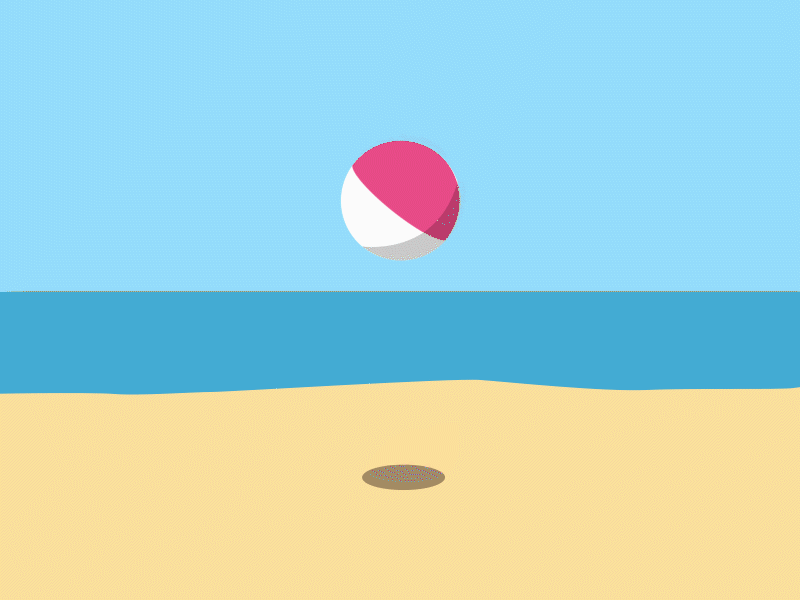
Does the design help users understand how to interact with certain elements? What clues do we provide the user that an action is able to be performed?
Affordances, in design, are the perceived properties of a thing from the way it looks and acts. Don Norman writes, in his 1988 book, “The Design of Everyday Things”:
“Knobs are for turning. Slots are for inserting things into. Balls are for throwing or bouncing. When affordances are taken advantage of, the user knows what to do just by looking: no picture, label, or instruction needed“.
- Donald Norman
We can use affordances in digital design too. Buttons are for clicking, switches for toggling and so forth. Again we come back to this idea of a language of the web, except this time it’s not learned - this should be instinctive.
It’s also why labels and instructions are often overkill - it’s counter-intuitive when a user is required to read labels to know what the most common UI elements are doing - they should be self descriptive.
Orientation
Does the user know where they are in the app, at all times? Do they know how to get back to the beginning? If they are within a constrained UI like a context or a modal, is there a clear way out, and an obvious reason why the scope of what they’re able to interact with has changed? Restricting interaction in areas of a user interface can help to indicate layers of detail and focus the user into completing actions in the right order. But we should always provide a clear escape route back to the top.
Hierarchy & visibility
Bearing in mind the key user journeys, are the most important actions obvious enough on the page? Visual hierarchy of information should make it clear what the most important, “headline” actions and information are, so that at a quick scan, a user can grasp how to do what they need. Sometimes it is important to constrain the amount that a user can see or do on a page, to avoid being overwhelmed by the amount of possibilities. It is then important to show how further actions can be drilled into, or revealed.
Feedback
Feedback in UX is about reassuring the user that something is happening, or something has happened. Loading spinners are there to let the user know that something is on its way. Warnings and errors let them know what’s happening if something goes wrong. In fact, when something does go wrong, we need to make a decision whether to fail silently, or to provide feedback to let the user know what happened and why. Usually this decision comes down to the question of whether whatever failed blocks the user or not.
This kind of UX feedback ties back into the idea of what kind of expectations the user has of the app. We need to make sure that these expectations are being met, and if they aren’t, then we talk to the user and let them know about it.

Conclusion
Why is this important? With the average human attention span being around 8 seconds, you need to consider that their primary source of concentration might not be your app. So, at a glance, can they get everything they need from your UI? Is it so obvious how it works, that your user feels like they know how to use it before they even start using it?
Intuitive design isn’t so much a UX goal, but a UX quality. It’s something we always strive for, which should be inherent in everything we make.
If you are interested in the subject, then read what these geniuses have to say:
The Secret to Designing an Intuitive UX – Prototypr
6 types of digital affordance that impact your UX | Webdesigner Depot
How a non-intuitive user interface can create a great user experience.
The Intuitive and the Unlearnable – Christina Wodtke – Medium
Image credits:
"Sampler" by Joanna Ławniczak
"Ball" by https://dribbble.com/qiyingj