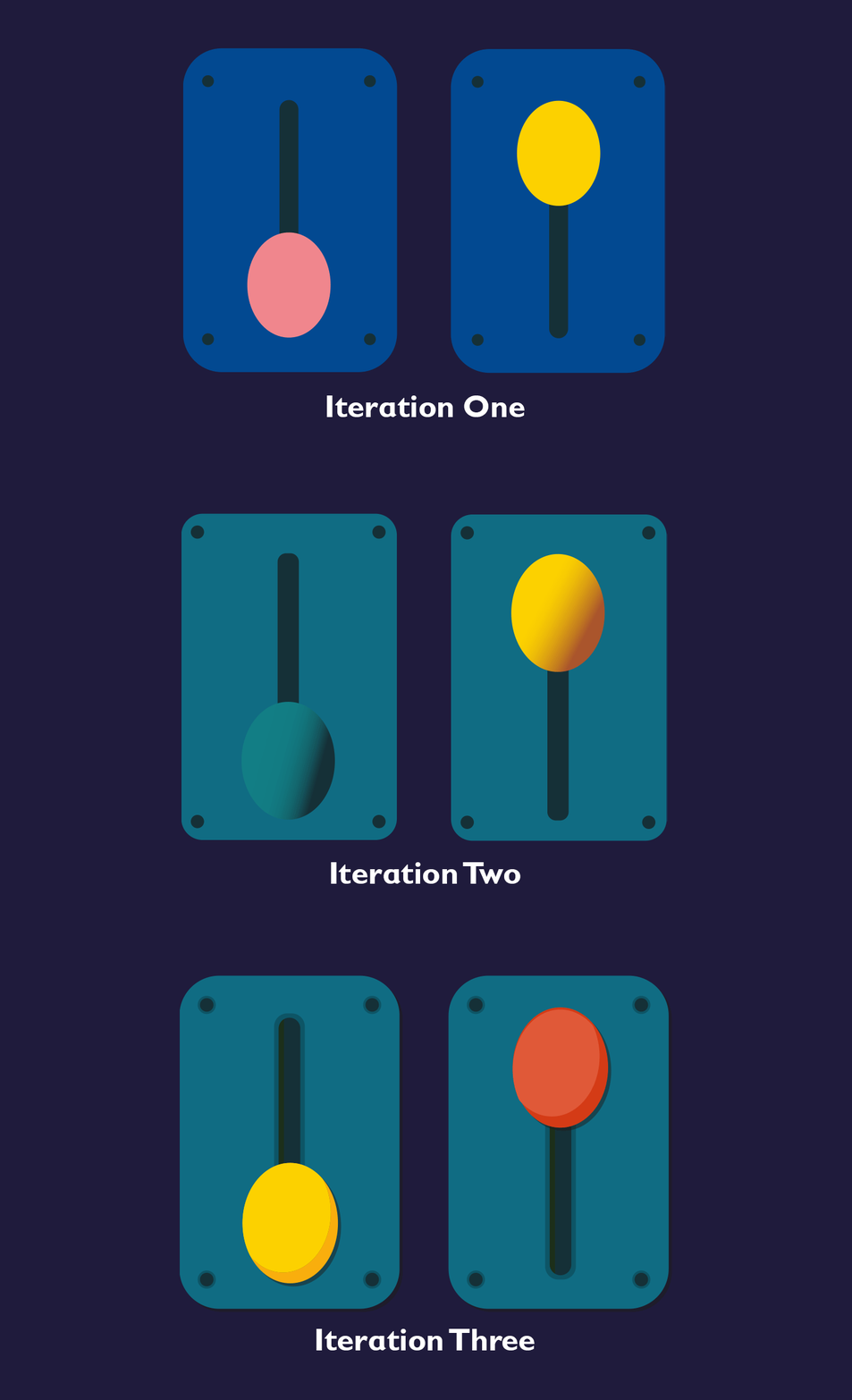
Further development of the Illustration style for Planet Teach
I’ve previously talked about developing the illustration style for PlanetTeach.
Whilst we’ve been working on the second phase of the pioneering EdTech platform, we’ve been reviewing the illustration style further.
Whilst generally we were pleased with the direction, and the style better complimented the branding and UI, the game still looked more like a prototype.
The original plan was to add lighting / shading to match more closely with the UI styling, and whilst this did have the desired effect, we still felt something was slightly off.
Having reviewed the below illustration together, we realised that the use of overly organic shapes jarred too much with the more geometric elements - it felt like we were trying to combine two very separate styles.
The next image is an example of how stripping out the more organic styled ‘milky way’ element made for a more cohesive and complete design. It also made the backdrop and foreground much more definitive, with a greater contrast between the two.
It’s interesting seeing an example of where removing elements rather than adding more can make something look far more polished and finished.
You can see the full progression of the three iterations of the illustration style for PlanetTeach displayed in the GIF below:

PlanetTeach is currently being offered as a free trial to selected schools until the October 2020 half-term. Spaces are limited — head over to planetteach.co.uk.