How to create atmospheric light in Illustrator
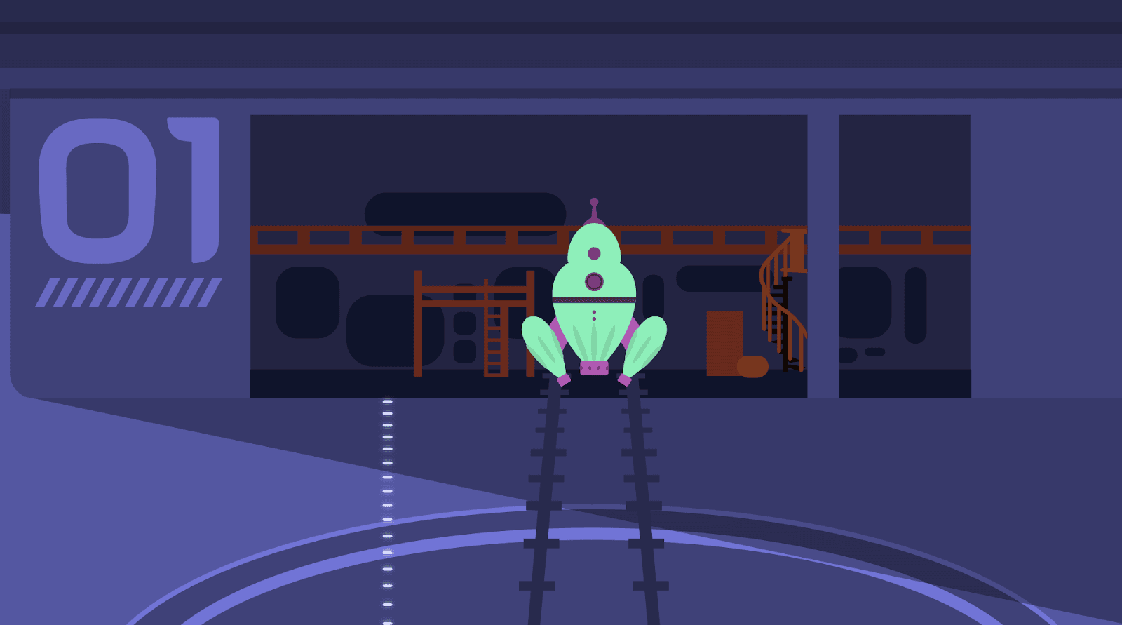
Start with your scene and consider where your light is coming from. In this scene, the lights are directly overhead and the source is artificial. Create your base shape, this should reflect the direction and spread of the main ‘beam’ of light. I’ve used a very light bright blue (#A5F9F9) and lowered the opacity to 20%.
I’ve also purposefully kept the colours of the background elements in the hanger dark as the layering of ‘light’ will brighten them.
Then think about areas which will still be getting light but not as much, how it spreads from the main source. I’ve made a copy of my base shape and manipulated it with the free transform tool to create a secondary, wider spread layer of light. This is the same opacity and colour as my base layer.
This building up of layers with the same opacity makes your main light source brighter.
For ease keep the main shape to the front as it quickly gets lost behind the other layers.

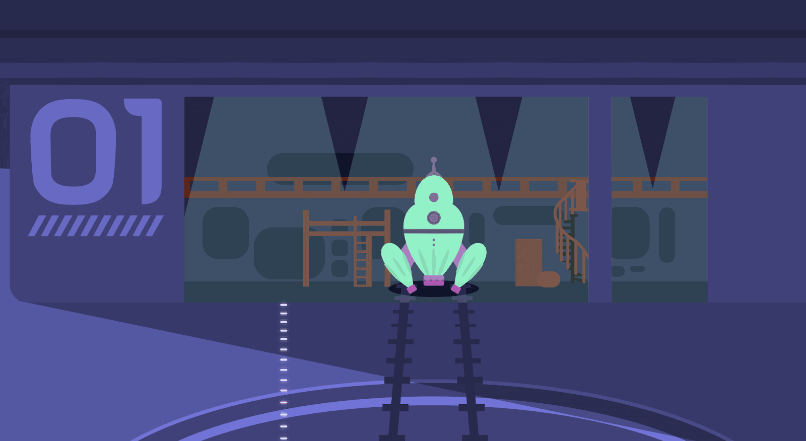
It’s also likely the light would spill out of the main hangar area in the scene. It being brighter closer to the entrance, with the light dimming the further from the main source it is.
Using the same process as before, create a base shape showing where the light would be.
As the light is no longer in the main lit space, I’ve set the opacity to 10%. I then replicated my base shape again and manipulated it to show a further spread of light. This is again the same colour and opacity as the base shape.
Be conscious of how the light will ‘spill out’ where there are areas that will cast a shadow. In this scene, the divider between the entrances and the rocket block the light.
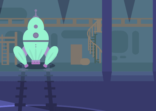
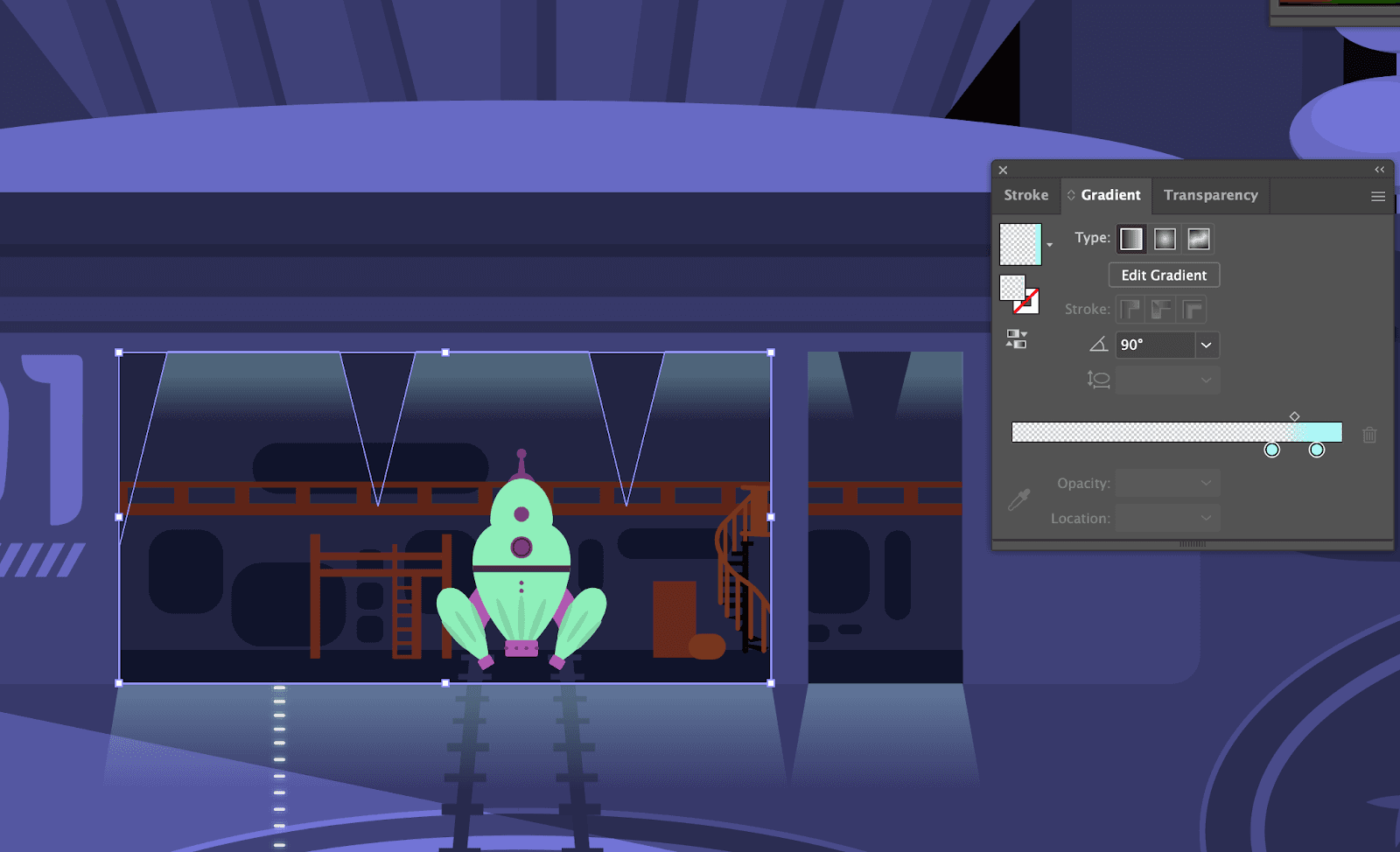
To finish, make a copy of the main shape and use the linear gradient tool.
I’ve created a two colour (both colours are the bright blue used everywhere else) gradient at 90 degrees and set the opacity of the bottom colour to 0%. The shape itself is set to an opacity of 30% so it's the strongest source of light. I’ve done this for both inside and outside the hangar, as shown. With the shape inside the hanger, I’ve kept the gradient shallower to depict a harsher glow around the ceiling lights. Whereas outside the gradient is much longer, this helps to show the light fall off as it gets further from the light source.
In the screenshot below I’ve created a new layer to show how this looks isolated.
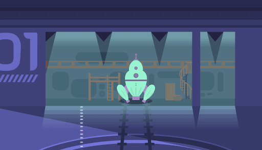
The final result! Play with staggering opacity and colours depending on the warmth, strength and source of the light to adapt this process for your work.