English Heritage - technical challenges of building an interactive map
We recently were lucky enough to win a brief to create an interactive experience for English Heritage. We were tasked with creating a map of English Myths, Legends and Folklore. The map needed to be an immersive experience, allowing the user to drag around exploring a beautifully hand-drawn (and then digitised map) looking for various myths at the English Heritage sites dotted around England.
All projects present a host of technical challenges and this project was no different. But the challenges were different. This was not a standard website, this was an experience. A lot of the rules that usually govern the building of a website went out of the window. We were providing an immersive experience that would draw a user into the stories of the English Heritage sites in a way that you could not achieve in a standard top-down website. This meant we were presented with a whole host of new challenges.
In this post, I am going to discuss some of the biggest challenges we faced and briefly discuss how we solved them.
You can find the finished project here.
Throughout the development of the map, we leant heavily on a fantastic service called Squoosh. Once the illustrations have been digitised we would then run them all through Squoosh. Squoosh is able to squeeze every last byte from an image without sacrificing quality. In some cases we were saving 60%, this obviously has a massive impact on the amount of data that is being downloaded.
Originally we were going to serve the map as a single image. But this quickly proved to be a crazy idea. The map is 8000px high and 7500px wide. With the amount of detail in the map and even with running it through Squoosh we were still looking at an image that was 11MB. And that is just the map! We had to come up with another plan.
We looked at other services and how they managed to serve huge assets. Google maps seemed like an obvious candidate to emulate. Google maps tiles the maps, breaking up the vast expanse into manageable chunks. We decided to do the same thing. We cut the map into 36 pieces and then lazy loaded the tiles as the user scrolled around the map. This provided us with the first of a number of impressive performance improvements.
Animations
The map is littered with animations, that really bring the experience to life but as we found out these living elements come with a cost.
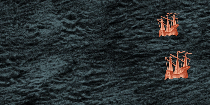
As with the map, the animated elements were hand drawn and then expertly animated in After Effects by our designer Matt. The animations we then exported through BodyMovin. This outputs a JSON file with the particulars of the animation and also the images needed for the animation.
To run the animations in the application we are using Lottie.
Lottie is a library for Android, iOS, Web, and Windows that parses Adobe After Effects animations exported as json with Bodymovin and renders them natively on mobile and on the web!
The issue we had was that Lottie was loading all the assets twice. Having looked into some similar issues on Github it appeared that this was by design to allow for smooth animations. This may be ok if you only have a small number of animations but for us, this simply would not do. It was adding a third onto the bundle size and had to be fixed.
Sam, the other developer working on the project noticed that the images needed for the animations could be encoded into the JSON file exported from BodyMovin. This would make the JSON files bigger but may save us from having the issue of the double download. Lucky for us, it did. We were able to reduce the bundle size massively and avoided the double downloads of the image assets.
Shear number of assets
Due to the nature of the map, there are a large number of assets. Each of the English Heritage Points of Interest (POI) has its own hand-drawn icon. When added to the animations and the other features like the cartouche and the clouds it proved to be a very large amount of data to be downloaded. The solution ended up being simple.
Anything that could be lazily loaded, was. This cut the initial download down by 60% and hugely improved the overall performance.
Not all browsers are made equal
Speak to any developer and they will, at some point complain about one or more of the modern browsers. These gripes are not unfounded as we found out. The way different browsers handle memory and rendering can have massive effects on the performance of the application. In our case, the application would actually crash the browser. This was not acceptable and so we looked to allow all users the best experience possible.
The answer to this was to progressively enhance the experience based on the device and browser. If we detected a partially supported browser then a warning would be shown and features would be disabled. This way we were able to allow most users with the best experience possible whilst letting them know that they maybe have a better experience in a more modern browser.
CSS scale, a memory hog to rule them all!
One final challenge we faced was the performance impact of using the CSS scale transform. This provided the user with a lovely experience if their browser could cope with the huge amount of memory needed to perform the transform. In most cases, it resulted in the browser crashing.
Using scale in most situations would not result in anything nearly this severe. But the way we needed to use it meant that it would consistently use all the available memory and crash the browser.
The only way to fix this was to remove the transform. We were able to replace it with something similar that gave the feeling of changing scale without actually doing it.
With a project like this, it is very easy to get overexcited about all the cool things we could do, glazing over the issues of performance and sub-par browsers. When developing on a pimped out (quad-core i7, 50+GB RAM) iMac and Gigabit internet it is easy to think everything you are doing will work everywhere and forget that most users are using “normal” machines. Obviously, this is exactly what we did. But once we got out the craptop we were quickly brought back to normality and got to work providing a great experience for everyone, not just those with amazing machines.
Takeaways
- Lazy load everything!!!
- Don't forget that most people are not using high spec iMacs with Gigabit internet.
- CSS scale transformations are very costly and may result in the browser crashing.
- Encoding your images into the exported JSON file can save lots of data.
We are super excited with the end result and we hope you enjoy the experience. This project was the culmination of 6 intense weeks of true teamwork and is a testament to the awesome things that can be built with the correct team.